These are my favourite images from my final shoot, I enjoyed doing the shoot as it was something a bit different to anything I had ever done before. To advertise the cups I thought that filling them with drinks that look good might make them seem more appealing. The downside of doing this shoot was that I did have to spend some money, but my images have turned out how I wanted them to so it was definitely worth it. The things I bought were Lavazza coffee beans, instant cappucino, hot chocolate, cream and a chocolate flake so that I could sprinkle chocolate on top of the drinks. I got other props such as stirrers and sachets of sugar from the college canteen.
I like the simplicity of this image, I think that the presentation of the contents of the cup is good, therefore makes the whole photograph more appealing.

I wanted to try to use a person in my images somewhere, I didn't really want to draw any attention away from the cup so I just asked someone to hold one. I wanted to give the illusion of being on-the-go as the cups are takeaway cups and people wouldn't usually be found sitting around drinking coffee from a takeaway cup, people usually walk whilst holding them.

 This is one of my favourite images from the shoot. I placed the cup onto a plain white board in my kitchen and then poured coffee beans all around it. I think that the fairtrade sugar at the side and the stirrer in the drink work as good props because fairtrade sugar is definitely something that appeals to people and I just think that they make the picture seem a bit more real. The image would look much better if I was to crop it so that only the white board was visable rather than bits of my kitchen unit around it, this can be easily done using Photoshop. The angle of this photograph also works well, the main focal point of the picture is the top of the cup and everything else is more out of focus, this will draw the viewers attention straight to the cup which is the whole aim of the competition.
 These two images are also two of my favourites from the shoot. They are set up in the same was as the image above, just taken from a different angle. The shallow depth of field allowed the cup to be totally in focus as it is at the front of the image. This, again, means that the cup is the main focal point of the image and is what the viewers will notice straight away. I also like that the Lavazza coffee bean packet is visable in the background, I think that this gives the image a real well established coffee shop kind of feel.


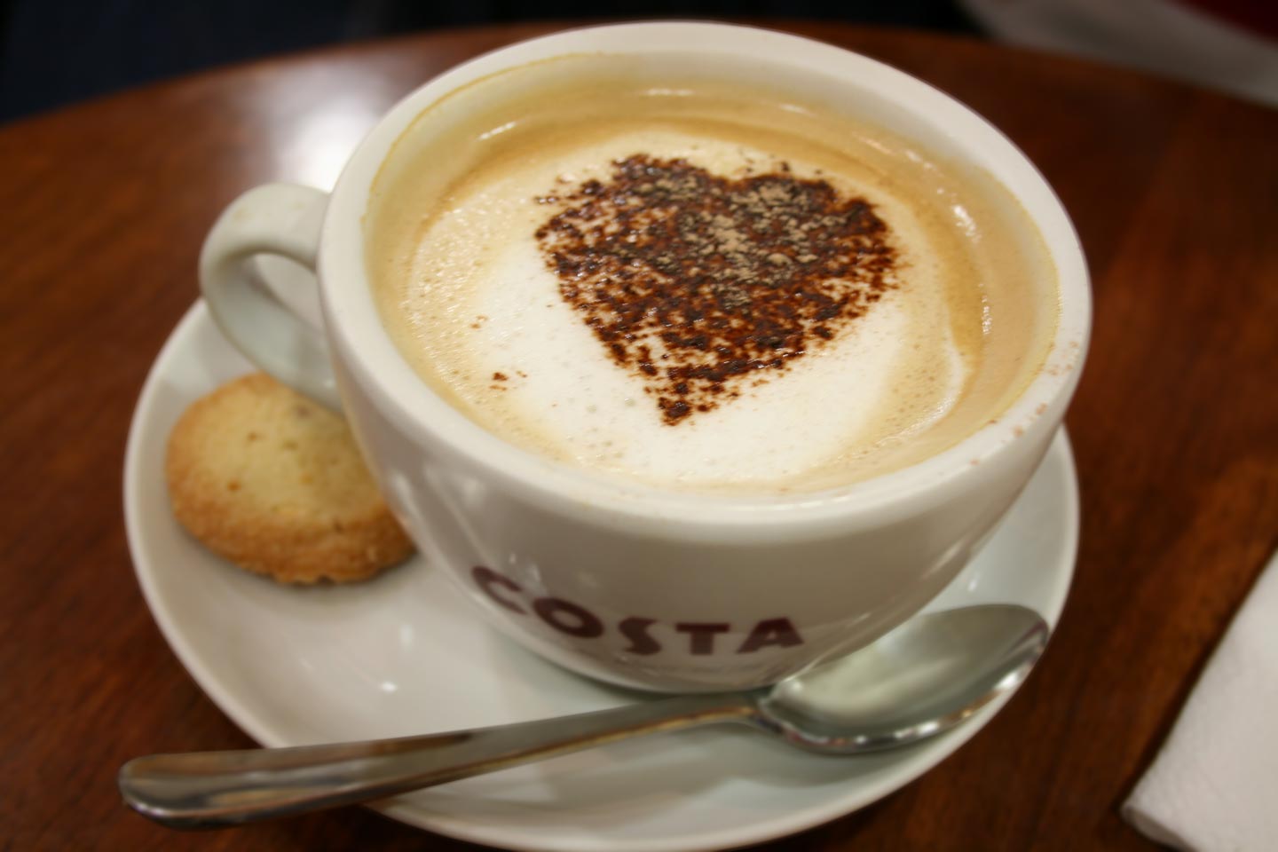
 With these images, I was initially going to attempt some coffee art, like making shapes in the froth such as hearts and stars or something similar, but there is a special technique to doing it and it requires an actual coffee machine to skim the milk so I decided to just top the drink with cream and crumbs of chocolate. I think that it still looks good and is definitely appealing as everyone likes a hot chocolate with cream! Even though these images still turned out how I wanted them to, I prefer the photographs of the cappucino.


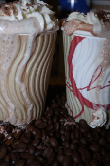
 I like the fact that this image is landscape rather than portrait. It means that both drinks fit in the picture better. I also like the angle, you can see the cream and chocolate so the photograph looks appealing but you can also still clearly see the cups.